

Balancing Paintings with Interior Design
Interior design is more than just placing furniture and selecting paint colours—it’s about creating a space that resonates with your personality while offering comfort and inspiration. One of the most dynamic ways to transform your home is by integrating bold, vibrant paintings into your décor. However, when not curated thoughtfully, such artworks can overwhelm a room, disrupting the desired serene atmosphere. That’s where balancing paintings with interior design becomes essential, ensuring harmony between art and the surrounding space.
In this guide, we’ll explore the delicate art of balancing paintings with interior design, ensuring bold, energetic artworks complement a tranquil space. We’ll dive into colour theory, scale and proportion, minimalist design, and the transformative power of lighting. In addition, we’ll discuss interactive elements to boost user engagement and share expert insights to solidify your design strategy. Whether you’re an art collector, a home décor enthusiast, or simply looking to enhance your living space, this comprehensive guide will provide actionable tips and creative ideas to achieve harmony in art and interior design.
How Do You Match Paintings with Interior Colours?
Colour is the soul of any space. It sets the mood, influences emotions, and can dramatically alter a room’s perception. When balancing paintings with interior design, the key is to create a visual dialogue between the artwork and the surrounding décor.
1. Colour Theory
Colour theory is a fundamental principle in art and design. It’s all about how colours interact with each other and how they can be used to evoke specific feelings. Here are some essential points:
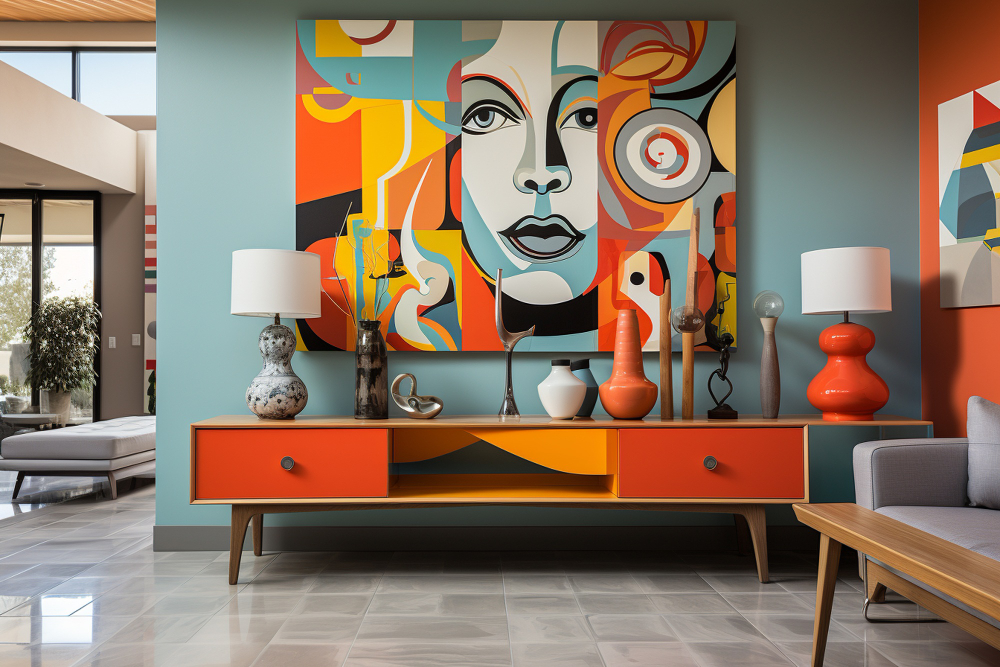
- The Emotional Impact of Colours: Warm colours like red, orange, and yellow can inject energy and passion into a space, while cool colours like blue, green, and violet tend to evoke calm and relaxation. Balancing a painting with a predominantly warm palette with cool, neutral elements in the room can create a harmonious contrast.
- Complementary Colours: Using complementary colours opposite each other on the colour wheel can create a dynamic yet balanced look. For example, consider using cool blues and greens on your walls or accessories if your artwork features bold reds and oranges.
- Analogous Colours: Another approach is to use analogous colours, which sit next to each other on the colour wheel. This strategy can ensure a more subtle transition between the artwork and the room’s overall colour scheme.
2. The Power of Neutrals
Neutral colours like white, beige, grey, and taupe are the backbone of serene interiors. They provide a blank canvas that allows vibrant artwork to stand out without competing for attention. Here’s how to use neutrals effectively:
- Backdrops That Enhance Art: A neutral wall or furniture piece is a calm backdrop. This strategy ensures that the bold colours of your painting become the focal point of the room.
- Balancing Bold Statements: Use neutral accents—such as rugs, cushions, or drapes—to create visual breathing room in areas surrounding the artwork. This will highlight your art and reinforce a sense of balance and calm.


3. Accent Colours and Their Role
Integrating accent colours from your paintings into other interior décor elements is a smart strategy. This approach helps in balancing paintings with interior design, creating continuity throughout the space and reinforcing a cohesive look.
- Repeating Hues: Pick one or two dominant colours from your painting and incorporate them into smaller décor items like throw pillows, vases, or tableware. This repetition builds a visual connection between different areas of your room.
- Dynamic Contrast: If your artwork features vibrant colours, consider using them sparingly elsewhere. This prevents the room from becoming too visually busy while still capturing the essence of the painting.
What Size Artwork Works Best for Your Room?
The size and scale of a painting can drastically alter its impact on a room. Understanding the balance between the artwork’s dimensions and your space’s size is critical in balancing paintings with interior design, ensuring that your design feels intentional and harmonious.
1. Consider Room Size and Proportion
A painting that is too large can overpower a small room, while an artwork that is too small may seem insignificant in a spacious area. Here’s how to find the right balance:
- Small Spaces: In cosy rooms, choose paintings with subtle accents rather than dominant features. Consider a single, moderately sized painting or a carefully curated gallery wall that doesn’t overwhelm the space.
- Large Spaces: Expansive living areas can handle larger, bolder pieces. In such cases, a statement painting can become the room’s focal point, drawing the eye and anchoring the décor.


2. Scale and Proportion: Getting It Right
Beyond room size, scale and proportion are critical in balancing paintings with interior design. This involves considering the painting’s dimensions and visual weight to create a harmonious look.
- Visual Weight of Art: An artwork’s “visual weight” is influenced by its colour intensity, texture, and subject matter. A painting with highly saturated colours or intricate details naturally draws more attention. Balance these with more straightforward, subdued pieces or décor elements in the same room.
- Gallery Walls: If you want to display several bold paintings, consider creating a gallery wall. Grouping artworks can form a cohesive unit that acts as a single focal point rather than a series of competing pieces. Experiment with symmetrical or asymmetrical layouts to find the best arrangement for your space.
3. Tips for Creating a Harmonious Display
- Rule of Thumb: Ensure ample negative space around a large piece to prevent visual clutter. A standard guideline is to leave at least 2-3 times the artwork’s width as a buffer zone on all sides.
- Mixing Sizes: Combining different sizes and shapes of art can create an engaging, layered look. However, the overall palette and style must be consistent to maintain harmony.
- Interactive Exercise: Consider using an online room planner tool or an augmented reality (AR) app to visualise various artworks in your space. This interactive element not only aids in decision-making but also increases engagement.
Should You Embrace Minimalism to Enhance Your Artwork?
Minimalism is more than a design style; it’s a philosophy that emphasises simplicity and clarity. In balancing paintings with interior design, removing excess clutter creates a backdrop that allows your artwork to shine.
1. The Minimalist Approach: Why Less Is More
A minimalist interior design can amplify the impact of bold paintings by providing a clean, unobstructed canvas. Here’s how to achieve a minimalist look that supports your art:
- Declutter Your Space: Begin by removing any unnecessary items that may distract from your artwork. A clutter-free environment encourages focus on the key elements of your design.
- Select Functional Furniture: Opt for pieces with clean lines and neutral colours. Avoid overly ornate or busy furniture that might compete with the visual intensity of your paintings.
- Embrace Negative Space: Negative space—the empty or open areas in your design—is as vital as the elements you choose to display. It creates a visual pause, allowing the eyes to rest and the artwork to breathe.


2. Practical Tips for a Minimalist Interior
- Streamlined Layout: Keep your décor arrangements simple. Use fewer pieces, but ensure that each one has a purpose. Like a bold painting, a well-chosen statement piece can define the space without overwhelming it.
- Quality Over Quantity: Invest in a few high-quality items rather than a surplus of décor. This approach enhances the overall aesthetic and creates a timeless look.
3. Incorporating Minimalism with Bold Art
- Curate Carefully: When selecting artwork for a minimalist space, choose pieces that complement rather than conflict with the overall décor. Bold paintings can be a focal point against a muted backdrop.
- Balance in Design: Balance is key, even within a minimalist framework. Ensure that the simplicity of your surroundings offsets the boldness of your paintings. For instance, a solid, neutral wall or understated furniture can help maintain equilibrium if your painting is filled with vibrant colours.
How Can Lighting Elevate Your Artwork?
Lighting is one of the most critical components of interior design, and its impact on artwork is profound. In balancing paintings with interior design, the proper lighting accentuates colours and details while setting the overall tone of your space.
1. The Role of Adjustable Lighting
Adjustable lighting solutions allow you to focus light on specific areas of your room, enhancing the visual impact of your art. Consider these strategies:
- Track and Recessed Lighting: Installing adjustable track or recessed lighting provides flexibility. You can direct beams of light precisely onto your paintings, highlighting textures and intricate details that might be missed.
- Accent Lighting Options: Accent lighting can include wall sconces, picture lights, or LED strip lighting. These options allow you to control brightness and create mood-specific effects, whether you want a dramatic highlight or a soft glow around your artwork.
2. Tips for Lighting Your Artwork
- Anti-Reflective Glass: Consider using anti-reflective glass for artworks framed behind glass. This minimises glare and ensures that the full vibrancy of the painting is visible, even in bright rooms.
- Natural Versus Artificial: Balance natural light with artificial lighting. Large windows can bathe a room in sunlight, but direct sunlight may fade delicate artwork. Use curtains or blinds to modulate natural light and supplement it with well-placed artificial sources.
- Creating Depth: Use a combination of ambient, task, and accent lighting to create depth in your room. This layered approach enhances the beauty of your artwork and makes the entire space feel more inviting.

Bringing It All Together: Creating a Harmonious Living Space
Balancing paintings with interior design is a multifaceted challenge that blends art, science, and creativity. You can create a living space that harmonises bold, vibrant paintings with a serene atmosphere by applying colour theory, scale and proportion, minimalist design, and strategic lighting.
A Step-by-Step Recap
1. Start with Colour: Understand the emotional impact of colours and use neutrals as a backdrop. Complement your bold artwork with accent colours and choose complementary or analogous hues to create visual balance.
2. Consider Scale and Proportion: Evaluate the size of your room and select artwork that fits appropriately. Use gallery walls for multiple pieces, and leave ample negative space around each art piece.
3. Embrace Minimalism: Declutter your space and choose simple, functional furniture. A minimalist approach allows your bold paintings to stand out without overwhelming the room.
4. Illuminate Your Art: Invest in adjustable lighting solutions that highlight the details of your paintings. Use a combination of natural and artificial lighting to create depth and drama.
Final Thoughts on Achieving Art and Interior Design Harmony
Balancing bold, vibrant paintings with a serene interior atmosphere is an art. By understanding the principles of colour, scale and proportion, and by embracing minimalism, you can create a space that allows your artwork to shine while maintaining a sense of calm. The interplay of colours, the thoughtful arrangement of artwork, and the proper lighting can transform your home into a haven of beauty and serenity.
The key is to ensure that the paintings complement the overall design and contribute to the desired ambiance.