
What is the best way to sell art online?
The best way to sell art online in 2026 is to combine a commission-free platform like Cosimo with your own social media presence and a clear pricing strategy. Start by taking professional-quality photos of your work, write descriptions that tell the story behind each piece, and list them on the best websites to sell art for your audience. Build an email list, use SEO to drive organic traffic, and ship safely with tracking. Consistency across all touchpoints – your listings, social channels, and customer service – is what turns a side project into a sustainable online art business.
Table of Contents
- What is the Best Way to Sell Art Online?
- How Does the Online Art Market Work in 2026?
- How Do I Prepare My Art for Sale Online?
- How Do Beginners Sell Art Online?
- How Can I Build a Strong Digital Presence for My Art?
- Can You Sell Art Without a Website?
- What is the Best Platform for Selling Art?
- Best Platforms to Sell Art Online for UK Artists in 2026
- How Should I Price My Artwork for Online Sales?
- What Marketing Strategies Work Best for Selling Art Online?
- How Do I Ship and Handle Artwork Safely?
- What Legal Considerations Should I Know About?
- How Do I Build Strong Customer Relationships?
- How Can I Scale My Online Art Business?
- Conclusion
- Key Takeaways
- FAQs: How to Sell Art Online
This guide covers everything you need to start and grow an online art business in 2026. From taking great photos and choosing the right platforms, to pricing, marketing, shipping, and UK legal requirements – it is all here.
- Professional photography is your most important sales tool when selling artwork online.
- Choose the right platform – learn how to sell art online without commissions through platforms like Cosimo, or build your own website for full control.
- Build a digital presence – establish an online gallery for artists through your website and social media.
- Price strategically – balance materials, time, experience, and market research
- Use multiple marketing channels – social media, email, SEO, and content creation.
- Know your legal obligations – copyright is automatic in the UK, but you need to understand tax and business structure.
- Build relationships – repeat collectors are the foundation of a sustainable art business online.
- Scale gradually – diversify products, automate systems, and use data to grow.
The art market has expanded beyond traditional galleries and exhibitions in today’s digital age. Artists of all skill levels now have unprecedented opportunities to showcase and sell their work to a global audience through online platforms for artists. Knowing how to sell art online has become a crucial skill for artists looking to turn their passion into profit. This comprehensive guide will walk you through everything you need to know about establishing your online art sales business.
Ready to begin? Artists who want to grow their visibility online can start by exploring accessible, low-cost ways to showcase and sell their work digitally.
1. What is the Best Way to Sell Art Online?
The best way to sell art online combines three things: the right platform, quality presentation, and consistent marketing.
For most artists – especially those just starting – this means:
- Listing on a commission-free platform, so you keep all of your earnings from day one
- Using social media to build visibility and direct traffic to your listings
- Creating a clear pricing strategy based on materials, time, and market comparisons
Whether you want to sell paintings online, sell artwork from home, or build a full-scale digital art marketplace presence, the fundamentals are the same. Your success depends less on where you start and more on how consistently you show up.

2. How Does the Online Art Market Work in 2026?
The online art sales market has expanded rapidly. More collectors now discover and buy art through digital art marketplace platforms than through traditional galleries.
This shift has made it possible for emerging artists to:
- Reach buyers worldwide without gallery representation
- Sell artwork from home with no physical storefront
- Offer multiple price points through originals, prints, and digital downloads
- Build a direct relationship with collectors
Different buyers want different things. Some seek original fine art. Others want affordable prints, digital downloads, or art merchandise. Knowing your audience helps you choose the right online platforms for artists and position your work effectively.
3. How Do I Prepare My Art for Sale Online?
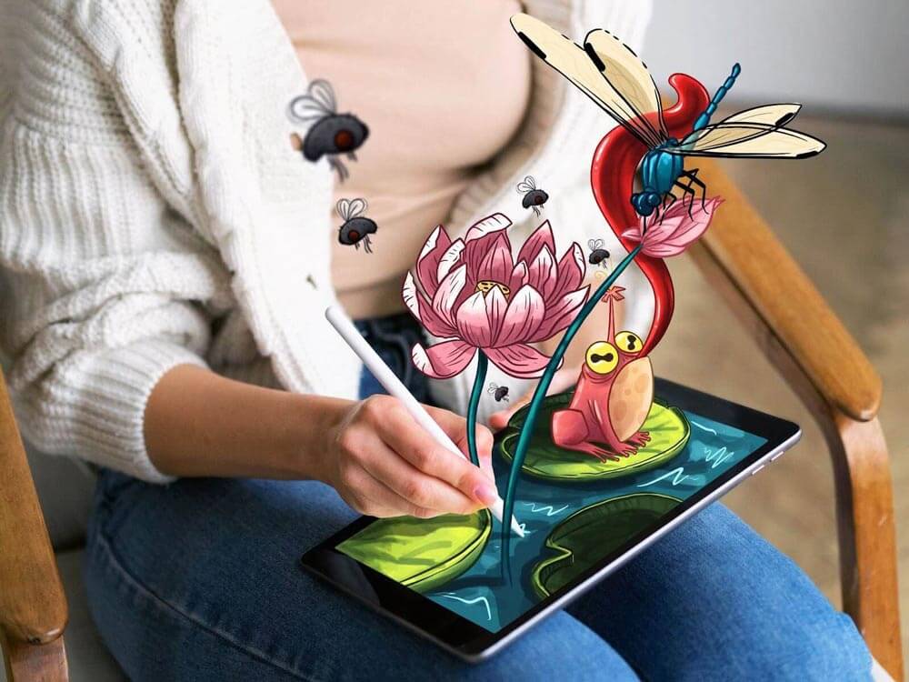
Before listing anything, your work needs to be photographed and documented properly. Buyers cannot see or touch your art in person – your images do all the selling.
Photography Essentials
- Use diffused natural light – it captures colour most accurately
- Shoot with a DSLR or high-quality smartphone camera – detail matters
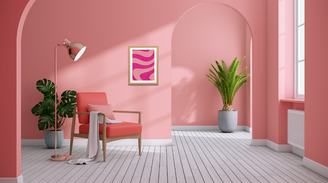
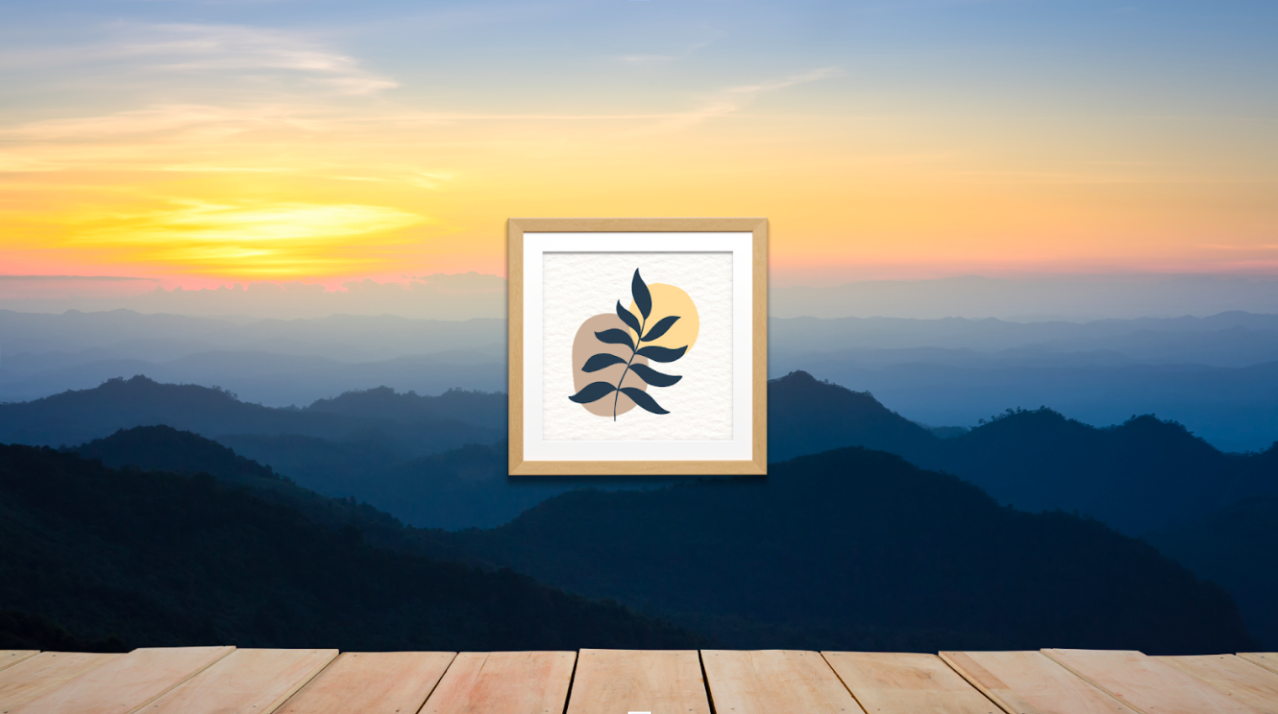
- Show scale – place the work in a room setting or next to a familiar object
- Capture close-ups – highlight texture, brushwork, and technique
- Edit accurately – make sure colours on screen match the real work

Beyond Photography
Each listing also needs:
- A description that tells the story behind the piece
- Dimensions, materials, and technique are documented clearly
- Physical artwork that is finished, signed, and ready to ship
- A certificate of authenticity, where appropriate
The more information and visual evidence you provide, the more confident buyers feel about purchasing. When selling artwork online, trust is everything.
4. How Do Beginners Sell Art Online?
If you are new to selling artwork online, the simplest path is:
Step 1 – Photograph your work using the tips above.
Step 2 – Choose a beginner-friendly platform. Cosimo and Etsy are the most accessible starting points. Cosimo is particularly well-suited to artists who want to sell art online without commissions from the very first sale.
Step 3 – Write your listings. Include a short story about each piece, the dimensions and materials, and clear pricing. Be honest and specific.
Step 4 – Share on social media. Post your work on Instagram, Pinterest, or TikTok. Link back to your listings. Show your process, not just the finished piece.
Step 5 – Be consistent. Most artists do not sell in their first week. Building an online art business takes time. Keep listing, keep posting, and keep engaging with your audience.
Step 6 – Ask for reviews. After each sale, follow up and invite buyers to leave a testimonial. Social proof builds trust with new buyers.
Explore our full guide to selling your art online for free →
Minimalism marked a significant departure from previous artistic conventions. It focused on simplicity, materiality, and direct engagement with the viewer. This creative movement had a widespread impact, not just in the visual arts but also in shaping design and architecture and influencing the overall cultural context.
5. How Can I Build a Strong Digital Presence for My Art?
Your digital presence is your brand. It is how collectors find you, form an impression of your work, and decide whether to buy.

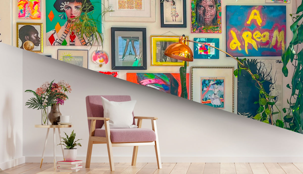
Your Website as an Online Gallery for Artists
A personal website gives you full control over how your work is presented. It should include:
- A portfolio of high-quality images
- An artist bio that tells your story
- Transparent pricing and a clear purchasing process
- Contact information
- A blog or news section to keep followers updated
Platforms like Squarespace, Wix, and WordPress offer artist-friendly templates that require no coding knowledge.
Social Media for Online Art Sales
Instagram, Pinterest, and TikTok are particularly effective for visual artists. Use them to:
- Showcase your creative process and work in progress
- Build a community around your artistic identity
- Direct followers to your listings or website
- Engage directly with potential buyers
Consistency in your online presence builds recognition and trust – two things that directly drive online art sales. Social platforms can be powerful tools for showcasing creativity – understanding how to use them effectively can help artists maximise their reach and build genuine engagement online.
If you work across different artistic styles – for example, if your practice spans both minimalism and maximalism – showing that range helps collectors understand the full scope of what you create.
6. Can You Sell Art Without a Website?
Yes, many artists sell artwork from home successfully without a personal website. Here is how:
- Cosimo gives you a fully built online gallery for artists, an integrated shop, and SEO support, with no commission on sales
- Etsy – large built-in audience, easy to set up
- Instagram / TikTok Shop – sell directly through social posts
- Email lists – direct sales to collectors who already follow you

A personal website adds credibility and control, but it is not required to start earning from your online art business. Many successful artists on Cosimo never build a separate site – the platform handles their portfolio, listings, and sales in one place.
If you do eventually want your own site, treat it as an investment for later. Focus first on building your audience and making your first sales through the best websites to sell art that already have traffic.
7. What is the Best Platform for Selling Art?
The best platform depends on your goals, your medium, and whether you want to pay commission.

For Selling Art Online Without Commissions
Cosimo is the standout choice. There are no commission fees on sales. Artists keep 100% of what they charge. The platform also includes SEO tools, a pricing calculator, and the Cosimo Academy – resources specifically designed to help artists build sustainable careers.
For a Large Built-In Audience
Etsy attracts a high volume of buyers looking for handmade and original art. The trade-off is platform fees (around 10–15%) and significant competition.
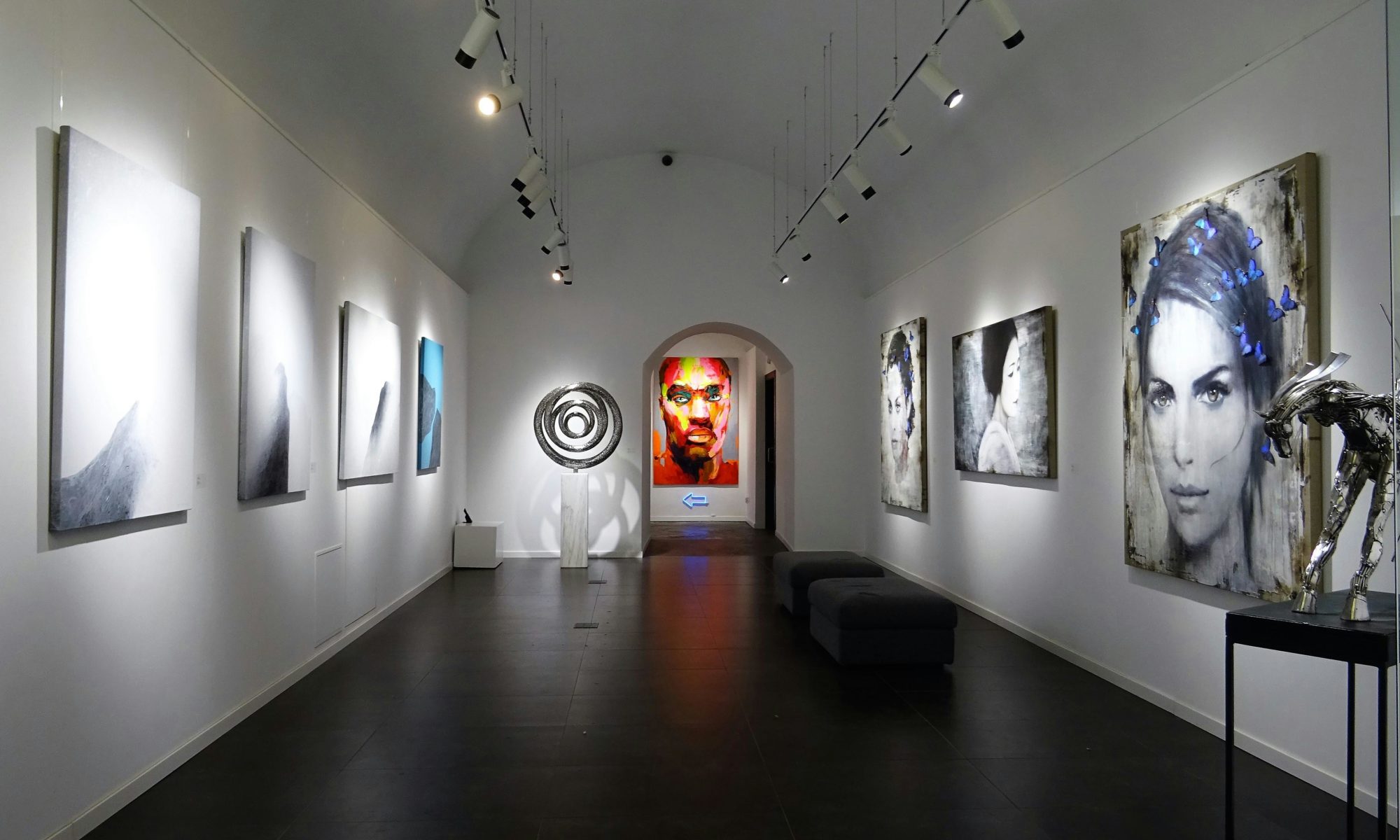
For Fine Art and Gallery Representation
Saatchi Art positions itself as a curated fine art platform. It charges 40% commission but brings a high-value buyer audience.
For Print-on-Demand Passive Income
Redbubble and Society6 apply your designs to physical products. They handle fulfilment entirely. Margins are low, but there is no upfront work after upload.
For Full eCommerce Control
Shopify, WooCommerce, and BigCartel let you build a fully customised online shop. Best for established artists with an existing audience to drive traffic.
Recommendation: Start on one or two platforms. Do them well before expanding.
8. Best Platforms to Sell Art Online for UK Artists in 2026
UK artists have specific considerations: VAT thresholds, Royal Mail shipping, HMRC tax obligations, and a strong domestic collector base to tap into.
| Platform | Commission | Best For | UK Shipping |
| Cosimo | 0% | All stages, UK-focused | Cosimo Pro (UK), personalised worldwide |
| Etsy | ~10–15% | Prints, affordable originals | Royal Mail / your choice |
| Saatchi Art | 40% | Fine art, international buyers | Managed by the platform |
| Redbubble | ~20% artist margin | Print-on-demand, passive income | Fully managed |
| Shopify | 0% (+ platform fee) | Established artists with an audience | Your choice |
| Your own website | 0% | Full brand control | Your choice |
Why Cosimo stands out for UK artists in 2026:
- Zero commission means more money stays with you from every sale
- Cosimo Pro provides UK shipping support with tracked labels via your account
- Built-in SEO means your listings can be discovered organically without technical knowledge
- The Cosimo Academy helps you develop marketing and business skills alongside your practice
9. How Should I Price My Artwork for Online Sales?
Pricing is one of the most challenging parts of selling artwork online. If the price is too high, buyers walk away. If the price is too low, you devalue your work – and exhaust yourself.
What to Factor In
- Materials and production costs
- Time invested in creating the piece
- Your experience level and reputation
- Comparable works in the digital art marketplace
- Platform fees (or lack of them, on commission-free platforms)
- Shipping costs

Pricing by Product Type
| Product Type | Pricing Approach |
| Original artwork | Higher – reflects uniqueness and your time |
| Limited edition prints | Mid-range – priced on exclusivity and edition size |
| Open edition prints | Lower – accessible price point for wider reach |
| Digital downloads | Low to mid – volume-driven |
| Licensed merchandise | Market-rate – based on use and territory |
Pricing Tools
Cosimo’s smart pricing calculator takes into account your experience, materials, and market data to suggest fair, consistent prices – removing the guesswork.
For a deeper understanding of pricing your art, and how to raise your prices as your career grows, explore the full Cosimo guide.

10. What Marketing Strategies Work Best for Selling Art Online?
Even the most talented artists need marketing to connect with buyers. Here is what works in 2026.
Content Marketing
Show your process. Tell the story behind your work. Create:
- Process videos and time-lapses
- Behind-the-scenes photos from your studio
- Artist statements and the thinking behind each piece
Collectors often connect with the story as much as the finished work. This is especially true for online art sales, where buyers cannot meet you in person.
Email Marketing
Build an email list from day one. It is the one audience channel you fully own. Use it to:
- Announce new works and collections
- Give subscribers early access and exclusive offers
- Share studio news and exhibition updates
Email outperforms social media for conversion – subscribers who have opted in are far more likely to buy than social followers.
Social Media Strategy
Each platform has its own culture. What works on Instagram may not work on TikTok. In general:
- Post consistently with relevant hashtags
- Engage genuinely with followers and fellow artists
- Use platform-specific formats (Reels, Stories, Pins)
- Show work in progress – not just finished pieces
For detailed platform-by-platform guidance, read our Artist’s Guide to Social Media.
Search Engine Optimisation (SEO)
SEO helps your art get found by people actively searching for what you create. Use relevant keywords in:
- Artwork titles and descriptions
- Image alt text
- Blog posts and website copy
Cosimo automatically optimises your listings using real search data – so your work is indexed and discoverable without needing technical SEO knowledge.
11. How Do I Ship and Handle Artwork Safely?
A great sale can be ruined by poor packaging. Here is what to get right:
- Packaging materials – use bubble wrap, rigid mailers, corner guards, and double-boxing for framed pieces
- Shipping insurance – insures higher-value works against damage or loss
- Tracking – always use a tracked service so both you and the buyer can follow the parcel
- International shipping – research customs documentation and duties before shipping abroad
- Unboxing experience – branded packaging, a handwritten note, and a certificate of authenticity make a lasting impression

Build shipping costs into your prices – either included in the listed price or as a clearly displayed separate charge.
For UK-Based Artists
- Royal Mail and Parcelforce offer reliable tracked domestic services
- For valuable pieces, specialist art couriers understand the specific requirements of transporting fine art
- Cosimo Pro (UK) provides shipping labels directly through your account, simplifying the entire process
12. What Legal Considerations Should I Know About?

Copyright Protection
In the UK, copyright is automatic from the moment you create original work. You do not need to register or pay a fee.
Practical steps to protect your work:
- Document your creative process with dated photos and files
- Use watermarks on digital preview images
- Consider the UK Copyright Service for additional evidence of ownership
- Handle infringement professionally – issue takedown notices where needed
Business Formation
As your online art business grows, consider your legal structure:
- Sole trader – the simplest option; register for Self Assessment with HMRC
- Limited company – more protection and credibility, with additional admin obligations
The Artists’ Union England provides guidance specifically for visual artists on registering for self-employment.
Terms and Conditions
Every shop needs clear policies covering:
- Returns and exchanges
- Cancellations
- Shipping damage
- Commission requests
Transparent policies build trust with buyers and protect you legally.
Tax Obligations
- Register for Self Assessment with HMRC once you earn from your art
- Keep records of income and allowable expenses
- Understand tax allowances specific to artists
- Register for VAT if your turnover exceeds the current threshold
Artquest and the Artists’ Union England tax guides are excellent resources tailored to visual artists. Consult an accountant familiar with creative businesses as your income grows.
13. How Do I Build Strong Customer Relationships?
Repeat buyers and referrals become the backbone of a sustainable art business online. Here is how to build those relationships:
- Personalised thank-you notes with every purchase
- Follow-up emails to confirm safe arrival
- Collector exclusives – early access or unique pieces for previous buyers
- Testimonial requests – positive reviews build trust with new collectors
- Community building – make buyers feel part of your creative journey
Every buyer interaction is an opportunity to create an advocate for your work. Exceptional service generates organic word-of-mouth – the most powerful marketing in any online art business.

14. How Can I Scale My Online Art Business?
Once you are making consistent sales, here is how to grow.
Product Diversification
Offer multiple price points and formats:
- Originals, limited editions, and open editions
- Merchandise featuring your designs
- Digital products – tutorials, brushes, or downloadable prints
- Licensing your art for commercial use
For everything related to digital products, read our guide to selling digital art online.
Automation and Systems
As volume increases, these tools save time without reducing quality:
- Automated email responses for common enquiries
- Social media scheduling tools
- Inventory management software
- CRM systems for tracking buyer relationships
Outsourcing and Collaboration
- Hire a virtual assistant for admin and customer communications
- Work with professional photographers for campaign shoots
- Partner with shipping specialists for consistent fulfilment
- Collaborate with other artists or brands for cross-promotion
Analytics and Adaptation
Use data to make better decisions:
- Track which products and formats sell best
- Monitor traffic sources to your listings and website
- Spot seasonal trends in your sales
- Test different marketing approaches and compare results
A data-informed approach to your online art business removes guesswork and lets you invest time and money where it actually works.
Conclusion
Mastering how to sell art online is a journey that combines artistic passion with entrepreneurial skills. The digital art marketplace offers unprecedented opportunities for artists to reach collectors worldwide without traditional barriers.
Remember that learning how to sell art online takes time and persistence. Success rarely happens overnight, but you can build a sustainable art business online with consistent effort and strategic planning.
The key to selling artwork online effectively is finding the sweet spot between creating authentic art that fulfils you and meeting the desires of your target market. Stay true to your artistic vision while remaining open to feedback and market trends.
As technology evolves, so will the methods for selling artwork online. Stay curious, continue learning, and adapt your approach as new online platforms for artists and opportunities emerge. The artists who thrive in the online art sales marketplace combine artistic integrity with business savvy and a willingness to evolve.
By following this comprehensive guide on how to sell art online, you’ve taken the first step toward turning your creative passion into a viable art business online. Now it’s time to implement these strategies and begin your journey as an online art entrepreneur.
Key Takeaways
- Professional photography is the single most important investment when selling artwork online.
- Commission-free platforms like Cosimo let you keep 100% of your sales from day one.
- A strong digital presence – through your listings, social media, and email list – is what builds long-term online art sales.
- Pricing should reflect time, skill, and market – not just material cost. Use a pricing calculator to remove guesswork.
- SEO, social media, email, and content each serve a different role in driving traffic – use them together
- UK legal obligations – copyright is automatic, but tax registration, terms, and business structure all need attention
- Customer relationships are the foundation of repeat sales and referrals
- Scale strategically – diversify, automate, and use data before expanding further
- For a trusted community of buyers and zero commission fees, Cosimo remains the best starting point for UK artists in 2026
FAQs: How to Sell Art Online
For beginners, Cosimo and Etsy are the most accessible starting points. Etsy has a large built-in audience and is easy to set up. Cosimo offers artist-specific tools, community support, and zero commission – making it ideal for those learning how to sell art online without commissions from the very first sale.
Factor in materials, time, your experience level, and market demand. Research comparable works in the digital art marketplace and account for shipping and platform fees. Cosimo’s pricing calculator and our full guide on how to price your art walk you through this in detail.
No. Many artists build a successful online art business entirely through platforms like Cosimo, which provides a fully hosted gallery and shop. A personal website adds credibility and brand control, but it is not necessary to start earning from selling artwork online.
Use social media, email newsletters, content marketing, and SEO. Focus on storytelling – show your process and the thinking behind your work, not just the finished pieces. For detailed platform strategies, read our Artist’s Guide to Social Media.
Key considerations include copyright (automatic in the UK), clear terms and conditions, tax registration with HMRC, and proper handling of returns. Registering your business structure adds professionalism and legal protection as your art business online grows.
Use bubble wrap, rigid mailers, and corner guards. Always ensure high-value pieces and use tracked services. For UK artists, Royal Mail offers reliable tracked domestic services. For valuable pieces, consider specialist art couriers. Cosimo Pro supports UK shipping with labels provided through your account.
Yes. Digital art can be sold as downloads, prints-on-demand, or NFTs. List work in usable formats (PNG, PDF, PSD) and watermark your previews. For a complete overview, read our guide to selling digital art online.
SEO helps your listings and website appear when people search for styles and subjects similar to your work. Use relevant keywords in titles, descriptions, image alt text, and blog content. Cosimo automatically optimises your listings for search – giving you organic discoverability without needing technical knowledge.
Yes. Prints give buyers at different budget levels a way to support your work. Limited editions create urgency. Open editions create passive income. It is one of the most effective ways to scale your online art business without increasing your workload significantly.
It varies widely. Some artists make their first sale within weeks. Others take six months to build visibility and trust. Consistency in your output, quality in your listings, and regular promotion across channels all influence speed. Starting on a commission-free platform means every early sale goes directly to you – which matters when you are building momentum.
Author
John Sewell is the founder of Cosimo and holds a Master’s Degree in History of Art from the University of Birmingham. He built Cosimo to give emerging artists fair, transparent ways to reach collectors directly. He was also shortlisted for the Great British Entrepreneur Awards. His background in art, creative entrepreneurship and digital marketplaces informs his writing on artist development, accessible art, and the future of online art sales.