

The art of interior design goes beyond simple aesthetics; it’s about creating an atmosphere that resonates with your personality and complements your living space. An essential element in achieving this balance is choosing paintings that harmonise with your room colour scheme. In this comprehensive guide, we’ll explore the delicate art of marrying artwork and ambience, ensuring your home reflects your unique style while maintaining a cohesive room colour scheme.
How Colour Affects Interior Design
Before we dive into the world of paintings, it’s essential to understand the significance of colour in interior design. Colours evoke emotions, set moods, and define spaces. When choosing paintings, considering the room colour scheme is crucial, as the colour palette can either enhance or disrupt the visual harmony of your room.
The Psychology of Colour in Your Room Colour Scheme
Understanding how different colours affect mood and perception is fundamental to creating an effective room colour scheme. Warm colours like reds and oranges can energise a space, while cool blues and greens promote tranquillity. Your chosen room colour scheme should reflect the intended purpose and atmosphere of each room.
Tips for Matching Paintings with Room Colours
1. Start with a Neutral Canvas
Begin with a neutral base for your room colour scheme, incorporating shades of white, beige, or grey for walls and large furniture pieces. This neutral canvas provides a versatile backdrop for your artwork and allows your room colour scheme to evolve organically.
2. Identify Your Dominant Colour
In every room, one dominant colour is often found in furniture or decor elements. Identify this colour; it will guide your room colour scheme and painting selection. This dominant hue should be the foundation of your room colour scheme strategy.


3. Complementary Colours for Dynamic Room Colour Schemes
Explore the colour wheel to discover complementary shades. These colours opposite each other on the wheel create a visually striking contrast. A painting featuring complementary colours can be a focal point in a room colour scheme dominated by a single hue, adding depth and interest to your overall ambience.
4. Analogous Colours for Harmonious Room Colour Schemes: Living Room
Analogous colours are adjacent on the colour wheel, creating a sense of harmony. Choosing paintings that incorporate analogous colours to your room colour scheme’s dominant hue can provide a soothing and cohesive look, particularly effective in room colour schemes for living rooms.
5. Monochromatic Tones for Sophisticated Room Colour Schemes
For a sophisticated and unified appearance, opt for paintings that use varying shades of your room colour scheme’s dominant colour. This monochromatic approach adds depth without overwhelming the senses and creates an elegant room colour scheme that feels intentional and refined.
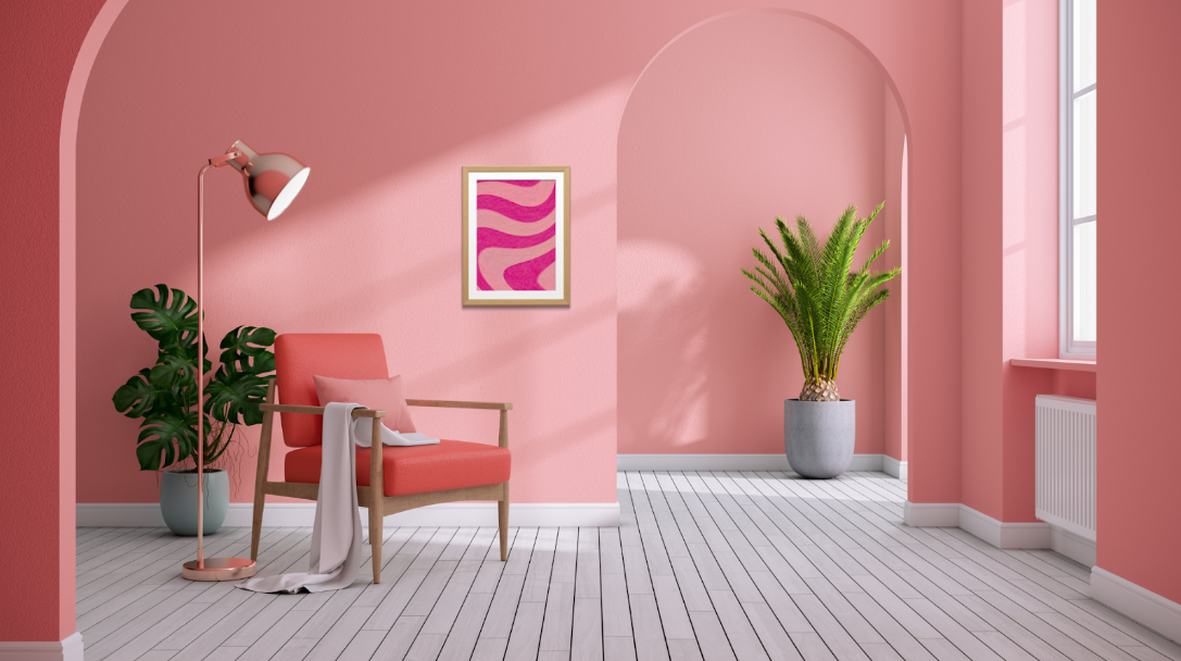
6. Bold Contrasts to Energise Your Room Colour Scheme
If your room colour scheme features a neutral palette, consider bold and vibrant paintings to inject energy and personality. A vivid artwork can be a conversation starter and a statement piece that elevates your entire room colour scheme.


7. Test with Samples Before Finalising Your Room Colour Scheme
Before committing to a painting, obtain colour samples or swatches to ensure they harmonise with your room colour scheme. Natural and artificial lighting can affect how colours appear, potentially altering the perception of your carefully planned room colour scheme.
8. Consider the Artwork’s Emotional Impact on Your Room Colour Scheme
Beyond colour, consider the artwork’s emotional impact. Does it convey the desired mood for the room colour scheme? A serene landscape may be ideal for a bedroom colour scheme, while abstract art can infuse vitality into a living area’s colour scheme.
Visual Balance and Placement
Creating a balanced composition involves more than colour; it’s also about the size, placement, and style of your paintings within your room colour scheme:
1. Scale Matters in Your Room Colour Scheme
Match the scale of your paintings to the room’s proportions and your room colour scheme. A large painting can dominate a small space, while small pieces may get lost in a big room, disrupting the visual flow of your room colour scheme.
2. Placement Precision for Optimal Room Colour Scheme Impact
When hanging paintings, consider eye level. The artwork’s centre should typically be at eye level, around 57-60 inches from the floor. However, artistic experimentation with placement can sometimes create visually appealing effects that enhance your room colour scheme.


3. Mixing Styles Within Your Room Colour Scheme
Eclecticism in artwork can create a dynamic and engaging atmosphere. Combining contemporary art with traditional decor can create a visually stimulating blend while maintaining your room colour scheme’s coherence.
4. Framing Unification
Choose frames that complement your room’s decor and colour scheme. Frames can tie the artwork to the surroundings or serve as a statement piece that enhances your overall room colour scheme.
5. Grouping Art for Gallery Wall Impact
Group paintings of various sizes and styles to create a gallery wall. This arrangement can be an artful showcase and a focal point within your room colour scheme, creating visual interest while maintaining colour harmony.
Expressing Your Personality Through Art
Ultimately, the choice of paintings should reflect your style and preferences while working within your room colour scheme. Your home is an extension of yourself; your chosen art should resonate with you emotionally while complementing your carefully curated room colour scheme.
Personal Style Integration
When harmonising paintings with your room colour scheme, remember there are no rigid rules; it’s an art form that evolves as you explore and experiment. The key is finding the balance between personal expression and maintaining a cohesive room colour scheme throughout your home.
Conclusion
Creating a harmonious room colour scheme that incorporates beautiful artwork requires thoughtful planning and creative vision. By understanding colour theory, considering scale and placement, and balancing personal expression with design principles, you can create a living space where every element works together seamlessly.
Remember that your room colour scheme is a reflection of your personality and lifestyle. Whether you prefer bold, vibrant colours or subtle, neutral tones, the key is ensuring that your chosen paintings enhance and complement your overall room colour scheme. With patience and experimentation, you’ll create a home that truly tells your unique story through the perfect marriage of art and ambience.
Frequently Asked Questions (FAQs)
The best room colour scheme starts with identifying your preferences and the room’s purpose. Consider the natural lighting, existing furniture, and the mood you want to create. A well-planned room colour scheme should reflect your personality while creating a harmonious environment.
A successful room colour scheme typically includes 3-5 colours: a dominant colour (60%), a secondary colour (30%), and accent colours (10%). This balanced approach ensures your room colour scheme feels cohesive without being overwhelming.
Yes, mixing different art styles can work beautifully within a room colour scheme. The key is maintaining colour harmony while allowing varied artistic expressions to coexist within your chosen room colour scheme.
Your paintings should complement rather than clash with your room colour scheme. They can either harmonise with existing colours or provide intentional contrast as accent pieces within your overall room colour scheme.
Artwork doesn’t need to match your room colour scheme exactly. It should complement and enhance your room colour scheme, either through harmonious colours or strategic contrasts that add visual interest.