Creating a sense of openness in a smaller space can be challenging, but with the right elements, it’s entirely achievable. One of the most effective ways to enhance visual depth in small room design is through the strategic use of paintings. This blog explores how art can visually expand confined areas, making them feel more spacious and welcoming.
Creating the Illusion of Visual Depth in Small Room Design: Leveraging Colour and Design
Utilising colour and design principles similar to art can significantly influence the perception of space and visual depth in small room design. Designers employ various strategies to create the illusion of a more expansive area, making small spaces feel larger and more open.
Colour perspective can be adapted to interior design by strategically using colour temperatures. Warm colours, known for their ability to create a sense of proximity, are perfect for accent pieces and decor to draw attention and add warmth to specific areas. Conversely, with their receding effect, cool colours are ideal for walls and large surface areas, giving the illusion of a more spacious room. This play on colour temperature can visually expand a space and provide a sense of visual depth in small room design.
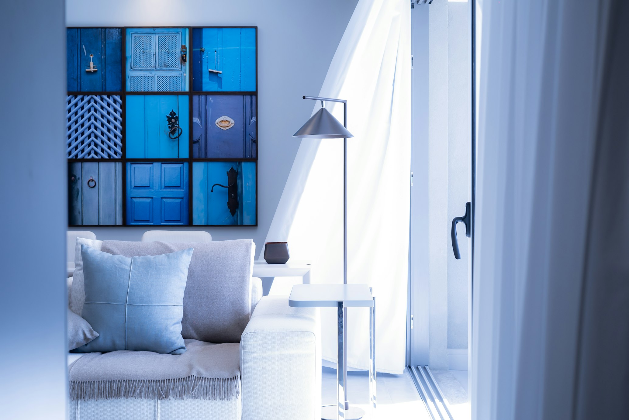
Transparency and opacity also play a crucial role in spatial design, particularly in enhancing the visual depth in small room design. By employing materials with varying degrees of transparency, designers can create intricate layers within a space. Transparent elements, such as glass or sheer fabrics, contribute to a sense of depth and lightness, suggesting a more expansive area. In contrast, opaque elements offer solidity and focus, effectively anchoring the space and adding to its visual depth.
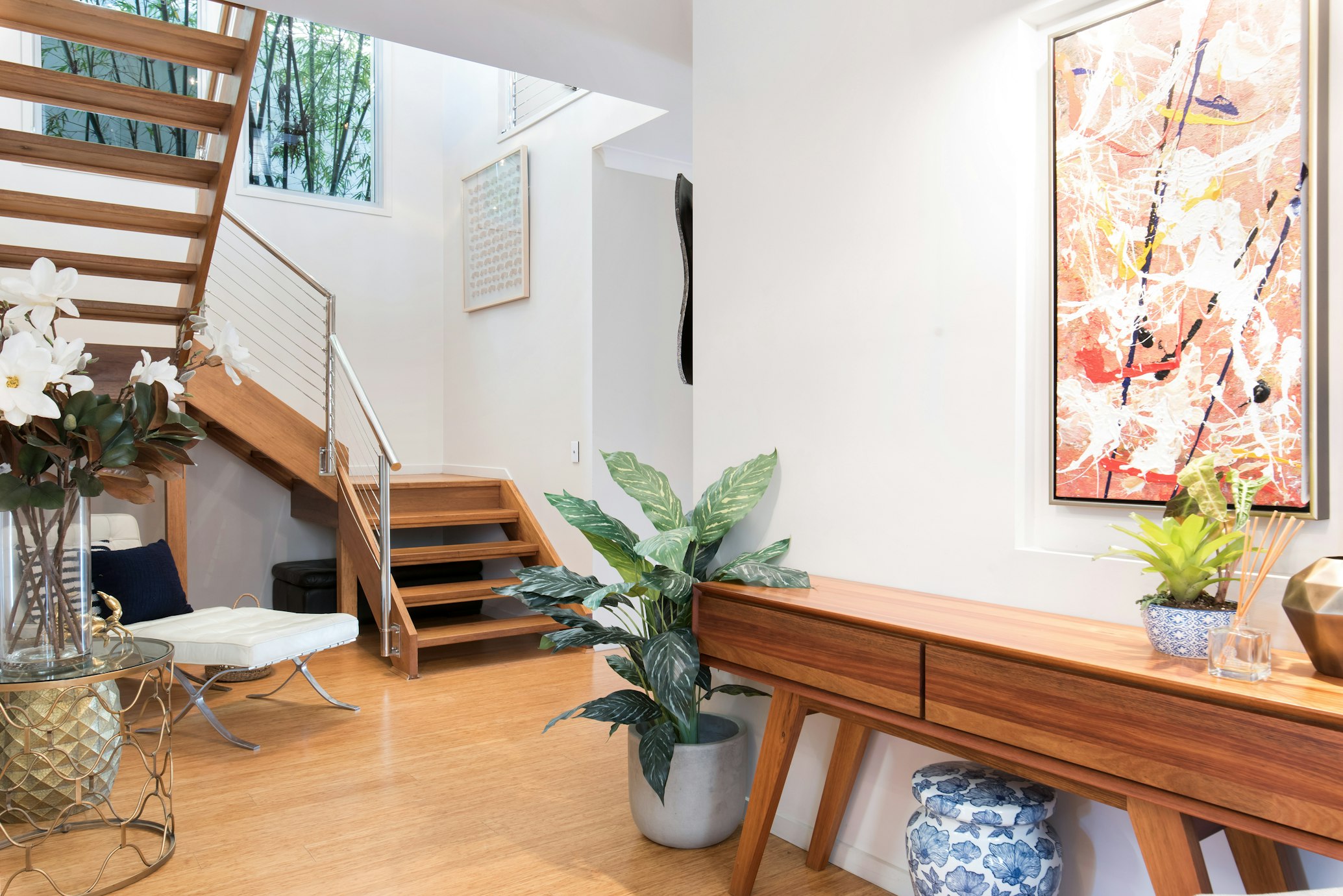
Inspired by the granulation technique in painting, texture variation can add visual interest and visual depth in small room design. Rough textures can draw attention and bring elements forward, while smooth, sleek surfaces can help parts of a space recede, enhancing the overall sense of depth.
Saturation levels can also influence spatial perception. Vibrant, saturated colours can make design elements pop, ideal for focal points or decorative accents. At the same time, muted tones can recede, making them suitable for larger areas to avoid overwhelming the space. Varying saturation levels can add visual depth in small room design, creating an illusion of more space.
Moreover, the symbolic meanings of colours can be leveraged to evoke specific moods and atmospheres within a room. For instance, blues and greens can create a serene and spacious feel, while warmer tones can make a space feel cosy and inviting. Incorporating these colours thoughtfully can add visual depth in small room design, making the space appear larger and more inviting.
Implementing design techniques akin to linear and atmospheric perspective can further enhance the illusion of depth. Strategic furniture, lighting, and decor placement can guide the eye along lines that mimic vanishing points, creating a sense of continuity and extension. Similarly, gradations in colour and lighting can replicate the atmospheric perspective effect, making distant corners of a room appear further away and thus more spacious.
By integrating these artistic principles of colour and design, small spaces can be transformed, making them appear more open, airy, and inviting, with a well-curated blend of colour, texture, and layout that maximises the perception of depth and space.
The Role of Scale and Placement
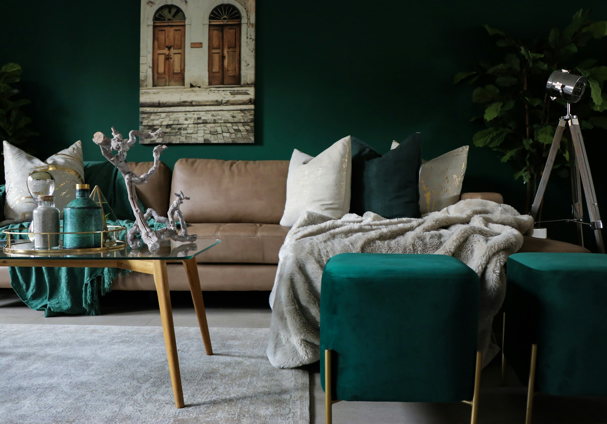
The scale and placement of artworks significantly influence the perception of space within a room. Large artworks tend to command attention and set the mood, transforming a room by adding energy and becoming an integral part of the space. They can make a dramatic impact and are often considered an artistic decision rather than just a piece to fill space. The trend towards larger artworks has grown, with sales of art larger than 1,000 square inches seeing a significant increase, indicating a growing appreciation for the dramatic effect that large pieces can bring to a room.
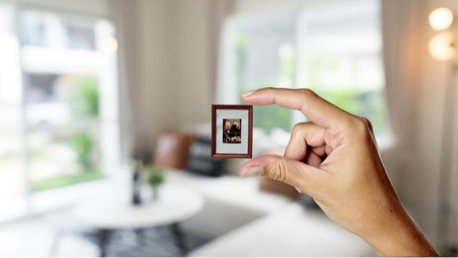
On the other hand, smaller artworks serve different purposes. They are often used as accessories to add pops of colour, texture, or interesting graphics without overwhelming the space. Smaller pieces can be more adventurous in their choice of colour or design due to their scale. Their placement needs careful consideration to appear proportionate, typically arranged with items of similar dimensions, to establish a cohesive and balanced presentation. Smaller artworks can add intriguing elements to a room, especially when detailed and placed thoughtfully.
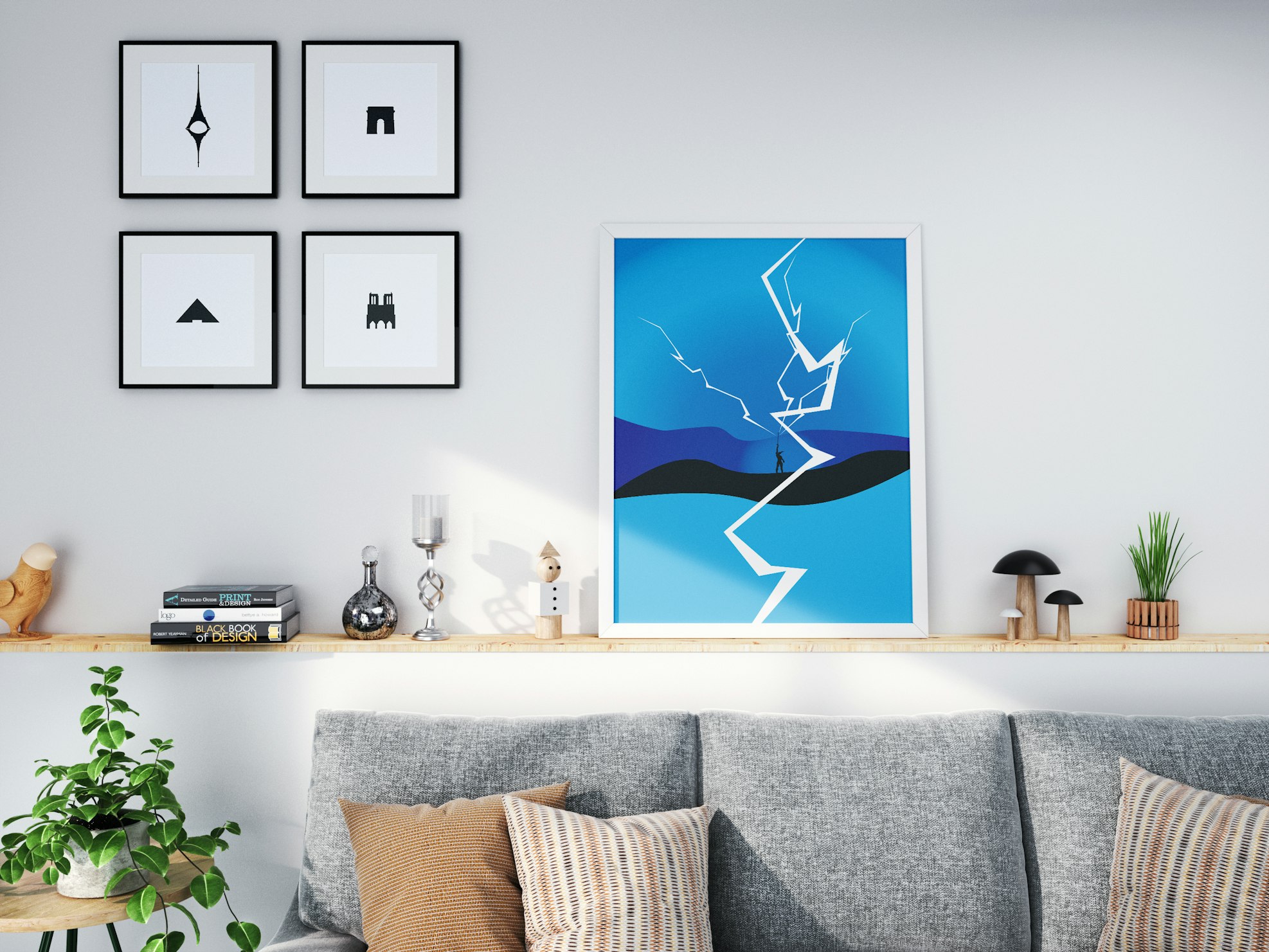
Both large and small paintings have their unique advantages and challenges. Large-scale art provides a vast canvas for creativity and an immersive experience, allowing for expansive subjects and a more profound impact on the viewer. They require confidence in the medium, colour mixing, and the use of larger tools, along with the patience to invest significant time and effort. Smaller paintings, while offering more control and fewer chances for mistakes, encourage experimentation and can be more convenient for artists working in limited spaces or those new to painting. They allow for detailed work and can be easily changed or adjusted without wasting time or resources.
Whether opting for a large focal piece or a collection of smaller works, the key lies in understanding the effect you wish to achieve in your space and choosing accordingly. The impact of art on room perception is profound, with scale and placement playing critical roles in creating the desired atmosphere and visual experience.
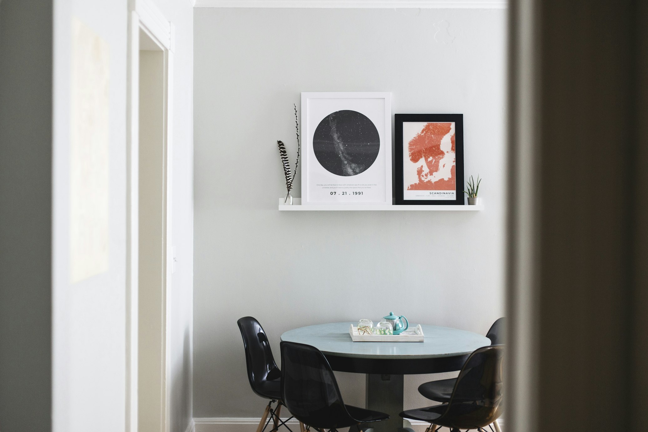
Visual Depth in Small Room Design: Thematic Continuity for Visual Expansion
Selecting artworks that complement the room’s theme or colour scheme is a strategic approach to unify the space and enhance its perceived expansiveness. Artworks that reflect or enhance the room’s existing palette and style can create a seamless transition between the room’s interior and the art itself, fostering a sense of continuity and depth. This approach is particularly effective in smaller spaces, where the strategic use of art can visually extend the room’s boundaries.
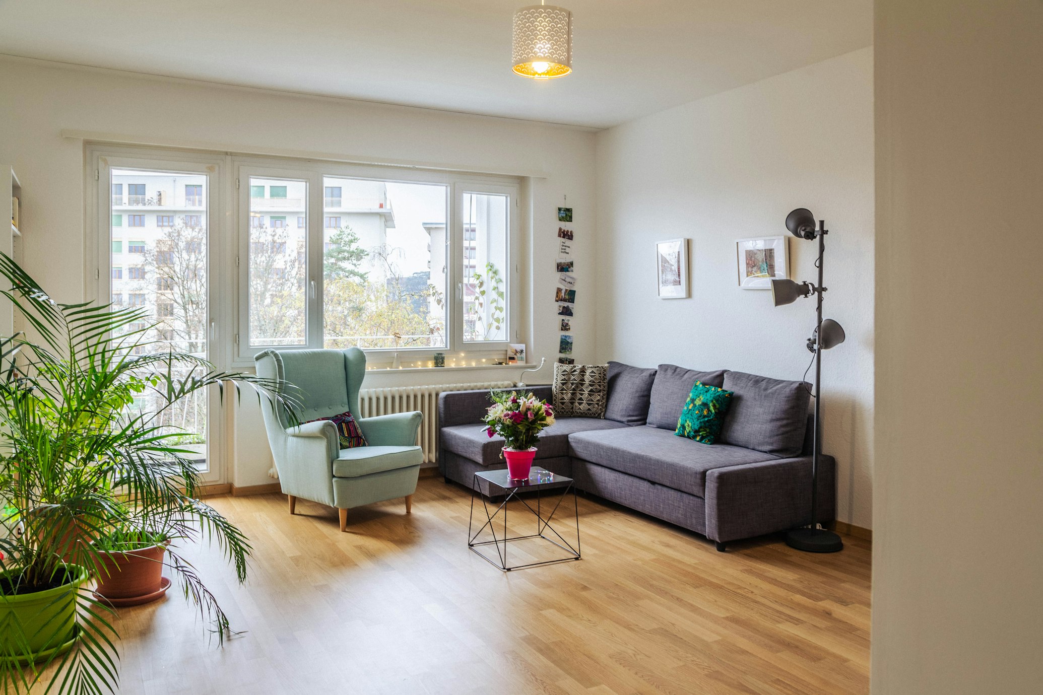
For instance, when choosing art for a living room, it’s essential to consider its overall aesthetic and ensure that the selected pieces harmonise with the existing décor, such as furniture, flooring, and architectural details. Art that resonates with the style and preferences of the occupants can also add a layer of personal expression and storytelling to the space, making it more inviting and unique.
In terms of placement, both wall art and tabletop art play crucial roles. Wall art should be hung at eye level for optimal viewing, with larger walls accommodating larger pieces or a group of smaller pieces arranged to create a dynamic display. On the other hand, tabletop art should be arranged thoughtfully, with consideration for the size and height of the pieces, to create a cohesive look.
Art is pivotal in interior design as a centrepiece, capturing interest and injecting vibrancy into any area. You can achieve a harmonious and aesthetically pleasing environment by meticulously choosing and placing artwork that aligns with the room’s decor and concept. Art has the unique capacity to stir emotions and set the tone for a space, creating specific vibes that enrich the room’s atmosphere. Furthermore, art introduces depth and dimension to interiors, bringing a dynamic and engaging visual appeal. The ideal artwork can complement and enhance the room’s existing colour scheme, textures, and furniture, contributing to a cohesive and unified look.
By incorporating these principles into your interior design strategy, you can effectively use art to create a sense of thematic continuity and visual expansion, transforming any room into a beautifully unified and expansive space.
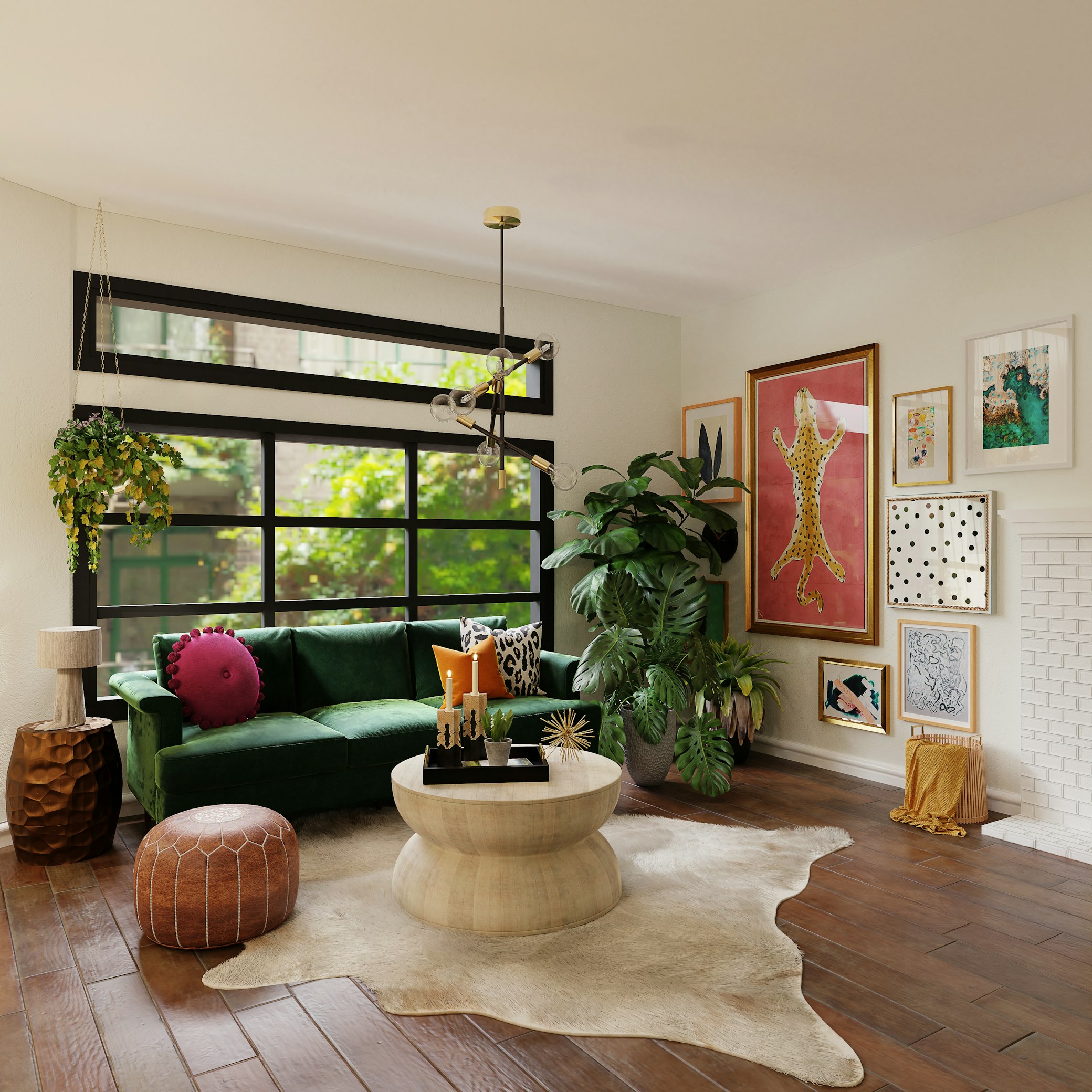
Visual Depth in Small Room Design: Reflective and Transparent Elements
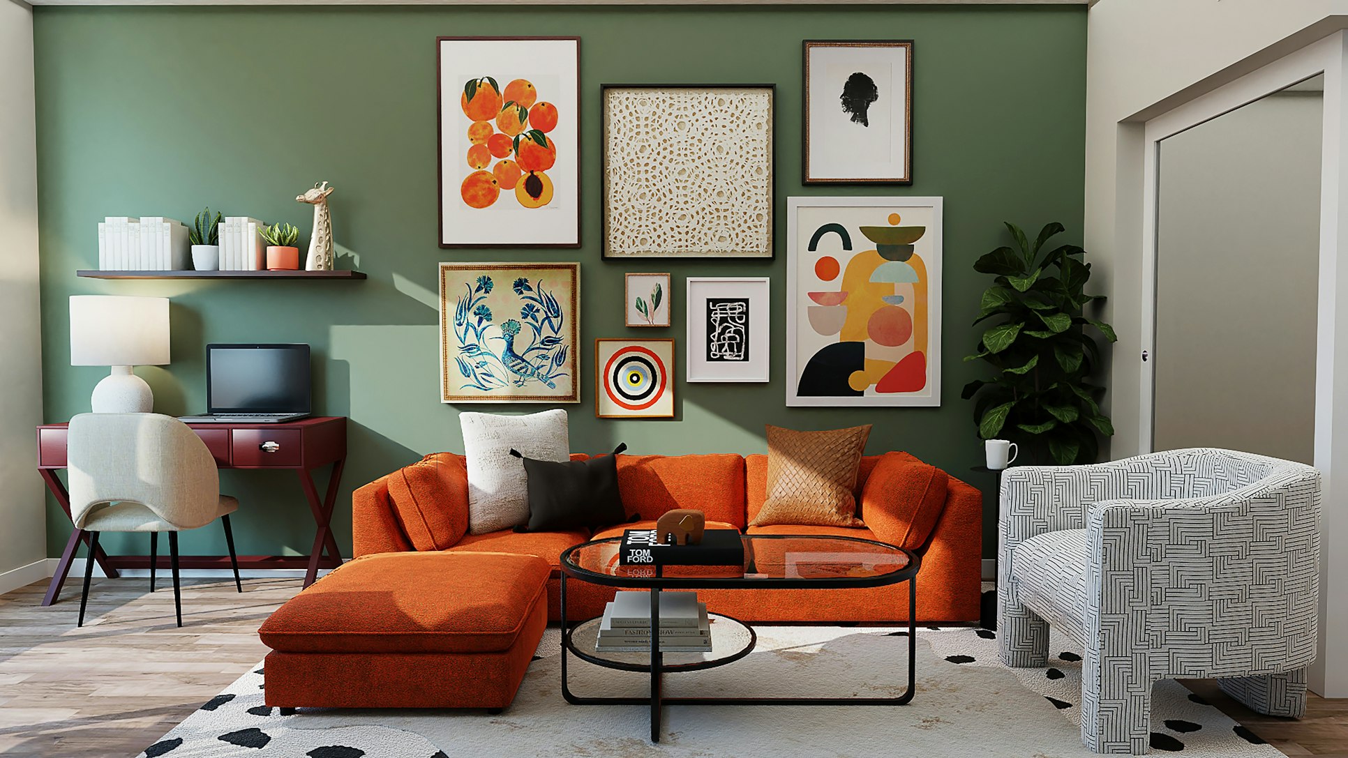
Artworks featuring reflective elements, such as water scenes or metallic accents, can introduce additional light and movement into the room, making it more dynamic and spacious. In artwork, transparent features such as skies or open windows can also enhance depth perception, providing a view into an envisioned space beyond.
Conclusion: The Transformative Power of Art
The strategic placement of paintings can transform a cramped space into an inviting sanctuary with perceived depth and openness. By considering factors such as colour, scale, perspective, and thematic continuity, it’s possible to use art not just as decoration but as a tool to enhance the visual depth in small room design. In this manner, paintings transcend their role as mere decorative pieces; they become key elements in crafting an illusion of expansiveness, making every small room feel more spacious.

